Responsive layout
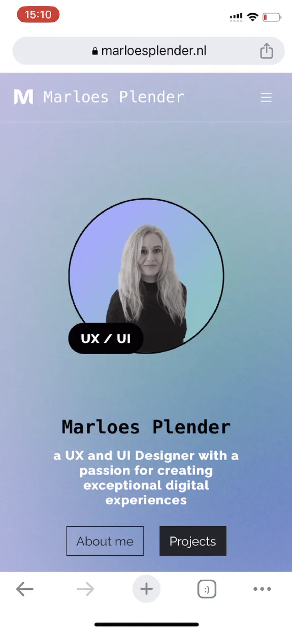
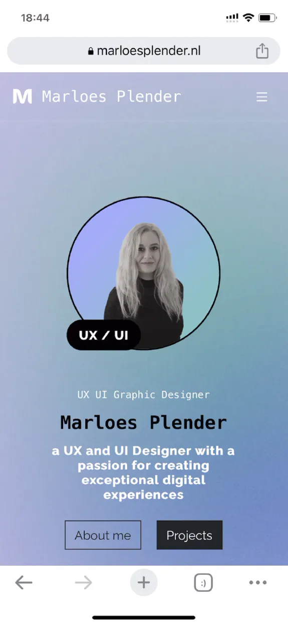
The layout of this website was created using a mobile-first approach and is optimized for smartphones, tablets and large desktop screens.
Header
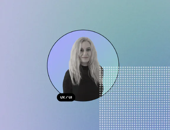
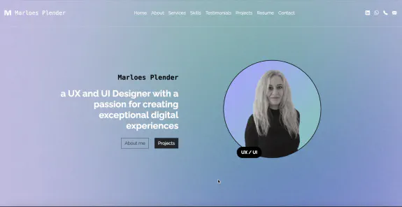
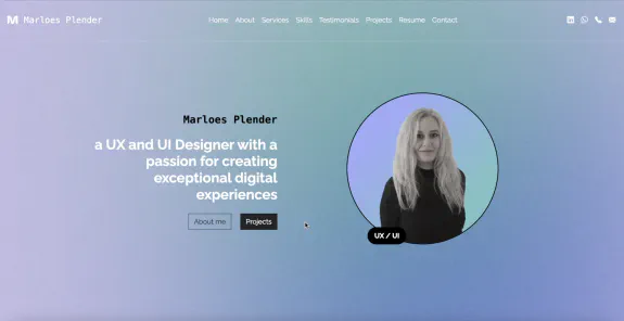
The header has a custom made background image and displays a hand-picked profile picture of Marloes. It features a typing animation as well as a graphic animation. You can see it in action in the responsive layout video above.
Responsive navigation
Even though the website consists of only one single page, it has a full-fledged navigation bar with links to sections within the page and external links to Marloes’ social media pages. On smaller screens, the menu is hidden behind a hamburger icon. When it is pressed, a drawer with navigation links smoothly slides in from the side.
Skills carousel
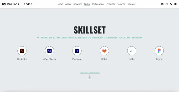
The skills section of the website displays Marloes’ wide range of skills in the form of a horizontal carousel of logos of the technologies she masters.
Portfolio
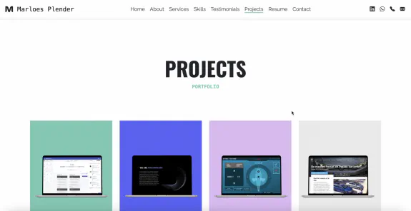
Marloes’ extensive portfolio was not easy to fit into a single page website. Her projects are displayed as tiles that trigger a full-screen overlay with more details about each project. Within the overlay, it is possible to browse back-and-forth between projects. The overlays contain descriptions, tags, images and videos related to each project.
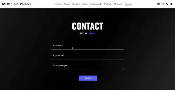
Contact form
Get in touch with Marloes directly via the contact form on her website. As the website is a static single page, it makes use of a free third party contact form submission service that delivers your message straight into Marloes’ email inbox.
